Responsive web design is a concept that allows websites to be viewed seamlessly on different devices, regardless of their resolution. To understand the concept of responsive web design, we need to understand a few key elements associated with it. Every web page contains various elements such as images, text, or menus. And depending on how these elements are placed in the website layout, we can set constraints to scale these elements to display according to the device’s screen resolution.
Basics of Responsive Web Design
The fundamental idea behind creating responsive websites is to scale up or down the layout or viewport to fit the device’s screen size. Setting a responsive website according to your screen resolution will also make it easier to test responsive websites. The viewport is the area of the web page that is viewed on the screen, it does not include browser toolbars, tab designs, etc., it simply includes the site content that is currently being viewed on the screen. Let’s look a little deeper to see what elements makes web design more responsive
Text: We know that all websites have text that needs to be scaled to fit the screen size. Resizing text for different screen resolutions while maintaining aspect ratios will certainly provide a consistent user experience when viewing a website from different devices. For example, the size of title and paragraph text on a computer screen and a phone screen cannot be the same. However, reducing the text size and maintaining the same ratio will certainly help maintain a consistent content display.

Media: Web pages should contain not only text, but also images or videos to keep readers interested. Both video and static images have different parameters that most designers strive to preserve. For video, as a rule, they keep the aspect ratio constant, take into account the screen orientation and set the appropriate settings. However, when it comes to images, in most cases they are optimized for easy viewing on small screens
Menu: Website menus and tabs are common elements that are used in most website development. While long horizontal menus are easy to view on desktop or laptop browsers, viewing them on mobile devices can be challenging. Responsive web design solves this problem by providing collapsible menu styles for easy browsing and navigation between web pages.
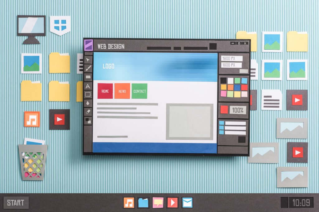
Web design mockup: A website is mainly planned keeping in mind the layout design. Web design mockups come in handy when you want to plan how your content will look on different devices and screen resolutions. Having separate grids in your layout will help you move them around when you want to optimize it for smaller screens. It also makes it easier to test a responsive website using various web testing tools.
Testing responsive web design
Now that we have a clear understanding of how a responsive website works, it’s time to learn how we can perform responsive web design testing to ensure high quality standards.
What do we need to test?
Testing for responsive design across devices should cover every element and component of a website. Finding a reliable responsive web design testing tool will also help you test different components easily. Responsive design testing includes components such as text, image optimization, visual testing, etc. All of these play a crucial role in delivering a consistent user experience.
Content style and alignment: We need to make sure the content is properly aligned and displayed consistently. You need to pay attention to the text size ratio so that the style and alignment are consistent across all devices.
Media Consistency: Ensure images are clearly visible and provide the necessary context across all devices. Videos and images must be consistently optimized for their respective device sizes. Make sure that images or videos do not overlap each other or text to ensure clear communication and a clean visual experience.
Menu: Make sure the menu can be expanded and collapsed on smaller screens so users can easily navigate the website. There is a compatibility issue on some devices that causes buttons and text to become misaligned, resulting in a poor visual experience.
Read also: https://webnoverse.com/category/web-page-design-primelis/
Mobile device orientation: Since mobile devices and tablets rotate easily, we need to ensure that web design is optimized for orientation and page content is displayed accordingly. Not being able to view a particular website or web application in different orientations is very frustrating and creates a negative user experience.
Conclusion
Scaling websites on devices with different resolutions and screen sizes is made possible thanks to responsive web design. However, testing these responsive websites is challenging as you will still have to test them on different devices and screen sizes to ensure quality and compatibility. Automating responsive website testing is becoming a key element for delivering quality responsive websites that perform well on a variety of devices.
